Summary
The Problem
I started by interviewing golfers about what app they used on the course. Most of them laughed. Pencil and paper, or nothing. The apps that existed tracked scores but missed everything that makes golf worth playing the stories, the rivalries, the history with your group. No app had ever tried to design for that.
The Solution
I built a mobile-first iOS app that made golf actually social logging rounds, tracking handicaps, competing with friends, keeping the history of your game with your people. Every feature came from what 20 participants told me they actually needed, refined across 3 rounds of testing before anything locked in.
Role
- Lead UX/UI Designer
- UX Researcher
- React Native Developer
Timeline
2025-2026 — 6 months- 3 research rounds
- Wireframe to production
- iOS deployment
Tools
- Figma & FigJam
- React Native
- Supabase
- Claude / MCP
- Notion
Contributions
UX Researcher
- Wrote the interview guides and built the research framework myself
- Ran 3 rounds of testing with 20 participants iterated between every round
- Built affinity maps to make sense of what I was hearing
- Made sure every design decision pointed back to a research finding
UI/UX Designer & Developer
- Took every screen from wireframe to high-fidelity no shortcuts
- Built the full component library in Figma before any production work
- Developed the app in React Native with Supabase backend
- Used Claude and MCP for schema reviews and design critiques throughout
Solution
High-Fidelity Design
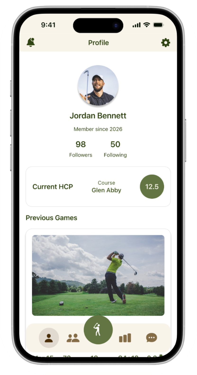
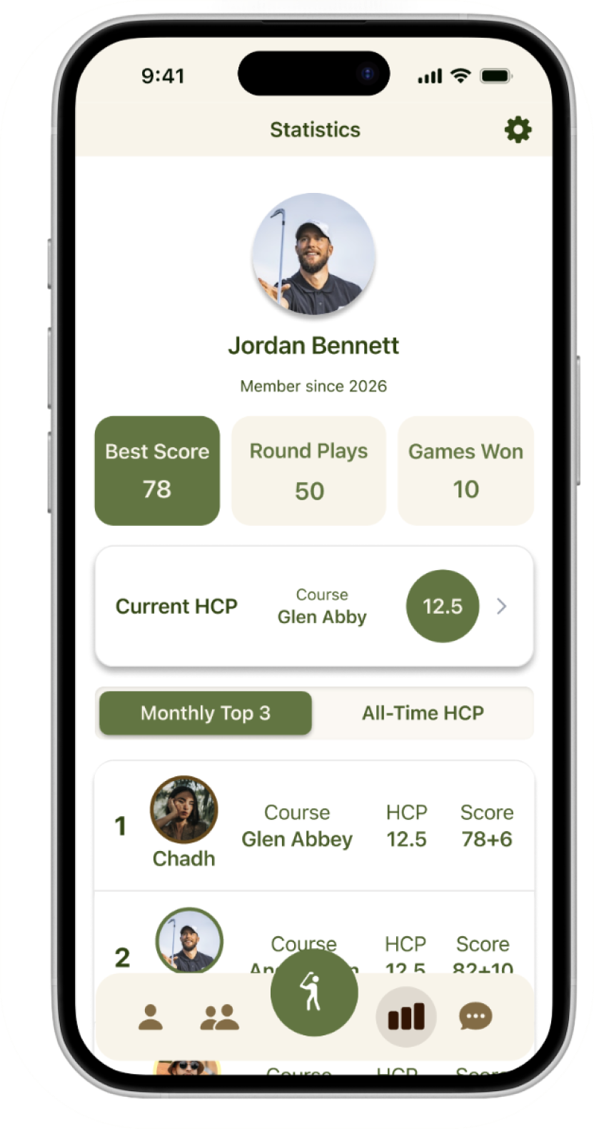
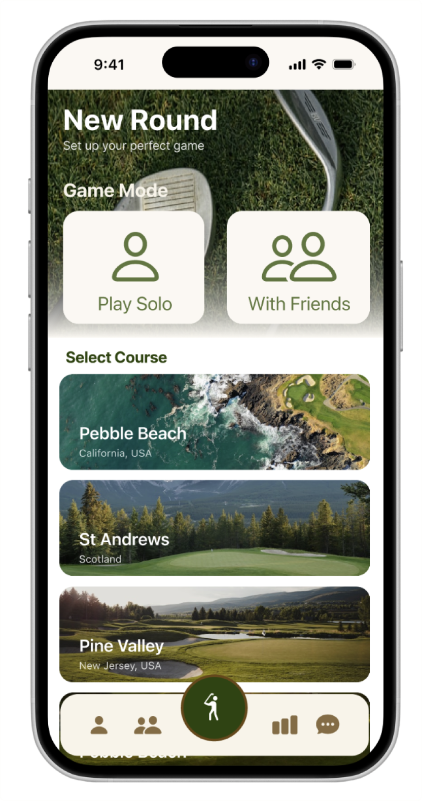
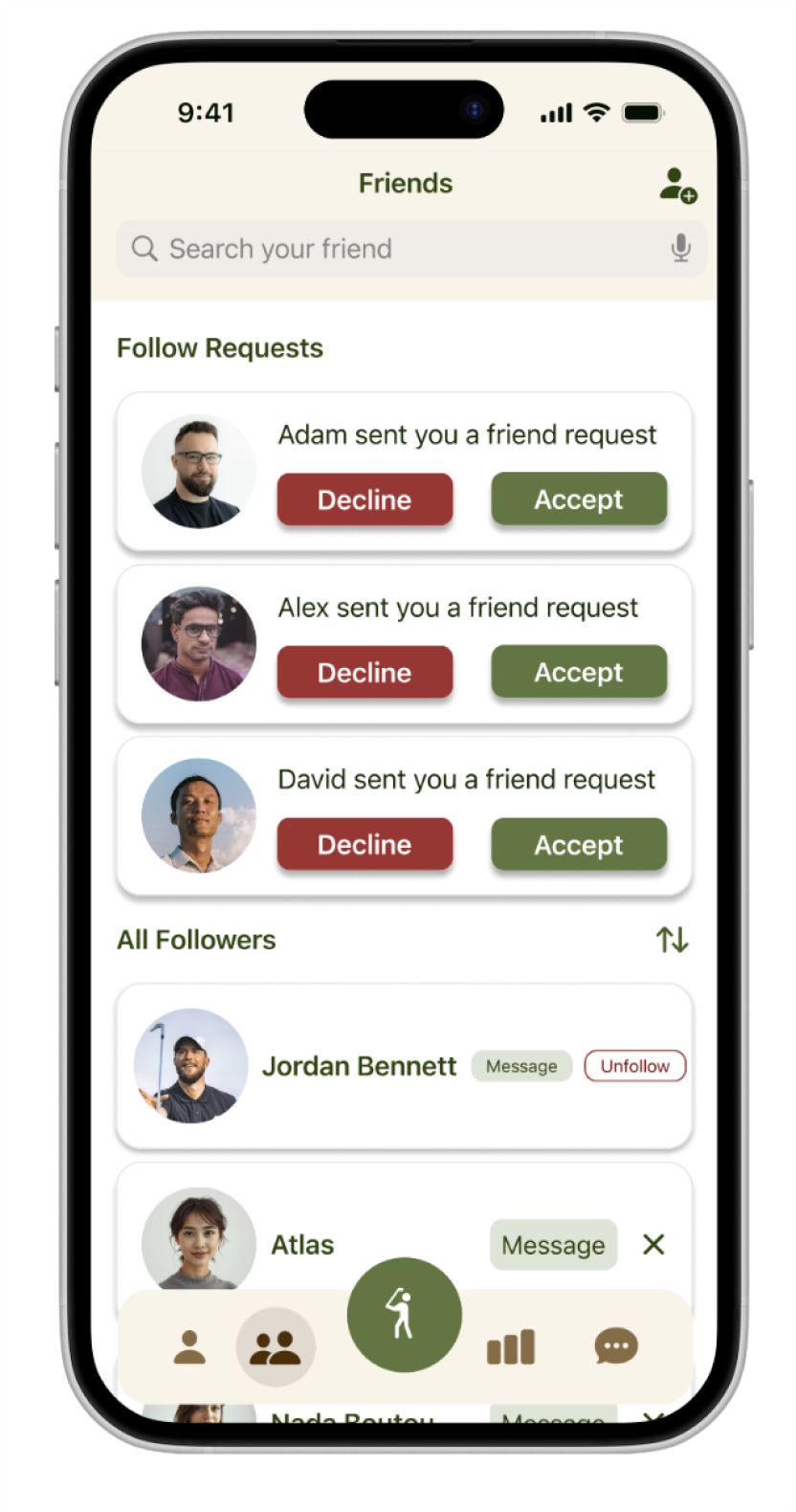
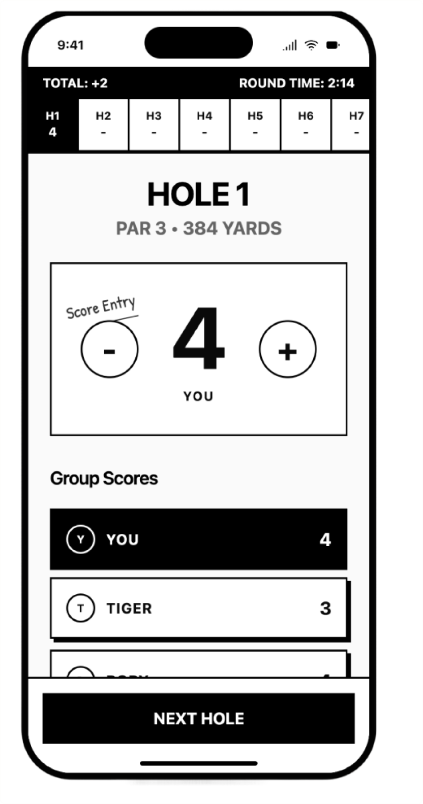
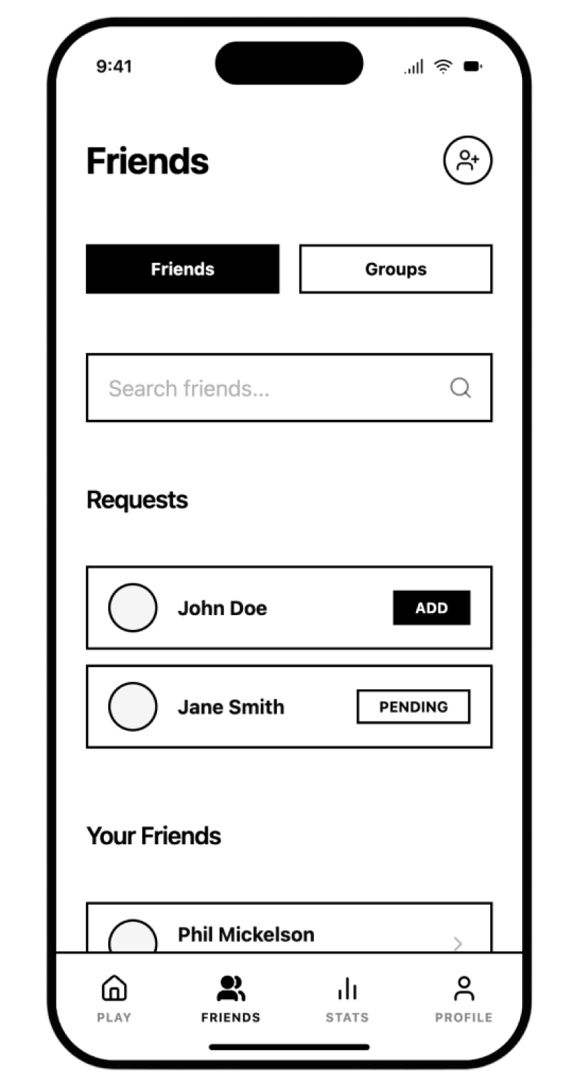
These are the screens after 3 rounds of testing not the first version, but the version that earned its way to production. Every screen here maps directly to something 20 participants told me actually mattered.
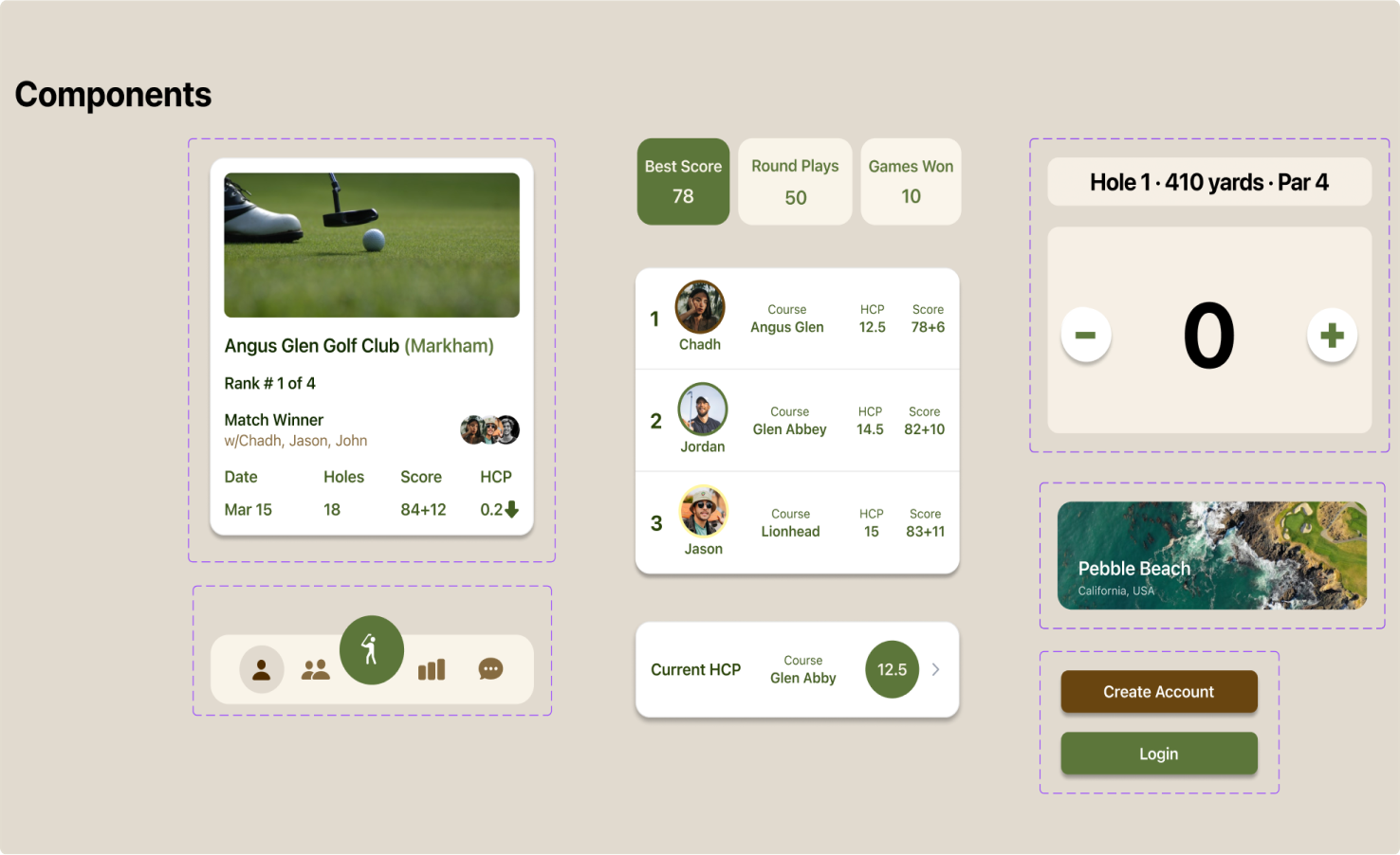
Design System
I built the full component library before I designed any screen. Typography scale, color tokens, button states, form elements, cards, navigation patterns everything. On a social app, consistency isn't nice to have. It's what makes the whole thing feel real.

Wireframes
Most of the real decisions happened here, not in high-fidelity. I used wireframes to work through layout, hierarchy, and core interactions so by the time I got to visual design, the hard thinking was already done.
Challenge
I went into this thinking the problem was scorecard friction. I was wrong. Once I started interviewing golfers, it became clear the real problem was that no app had ever tried to capture why golf is actually good the banter, the rivalries, the story of a specific round years ago. The digital tools existed to track numbers. They never cared about the experience.
Manual scorecard friction: Mid-round, players were either using paper or giving up on apps that were too complex to actually use while walking a hole.
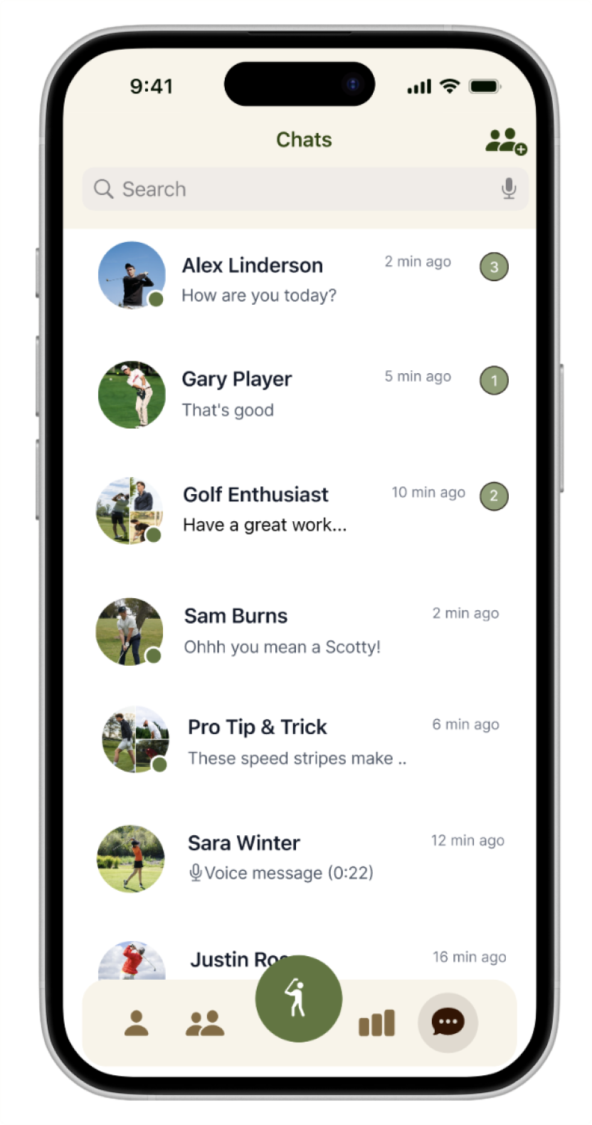
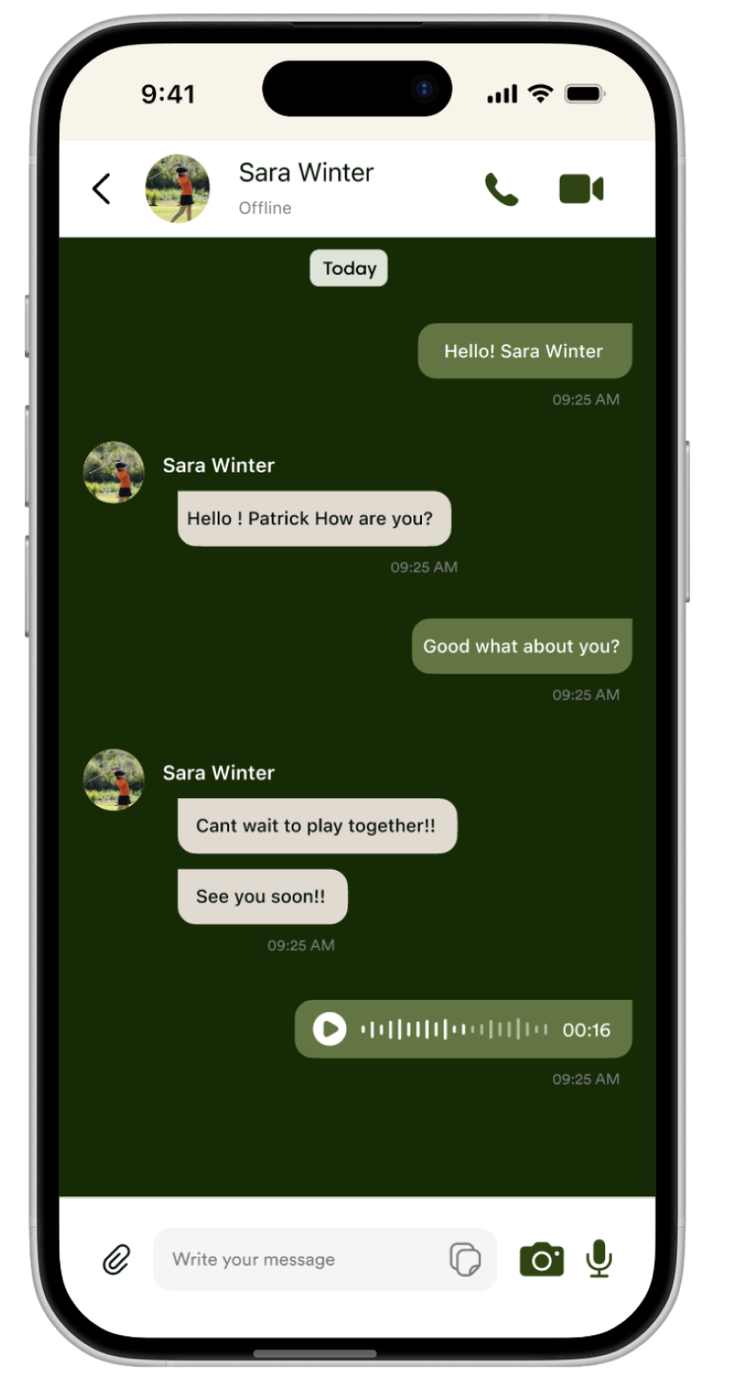
No community layer: The thing that makes golf worth playing for most people your group, your rivalries, your shared history was completely missing from every app.
Post-round recall: Every golfer I talked to had a story about a specific round. No app let them keep that. Just raw numbers, no context.
Handicap confusion: Most players I talked to didn't really understand their handicap or how it was calculated. They just knew the number and felt vaguely bad about it.
Key Insights
I interviewed golfers across skill levels casual weekend players, regular club members, competitive players because I knew the problems would look different at each level. 3 rounds of testing with 20 participants. Each round changed something.
Key insight: Every golfer described their best rounds in stories — not statistics. "I birdied 14 in the rain," not "I shot 78." That told me the app had to be built around memory and people, not numbers. The score is just the frame.
Design Strategy
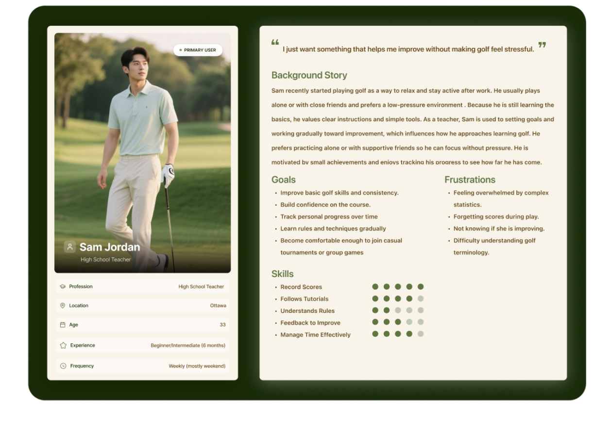
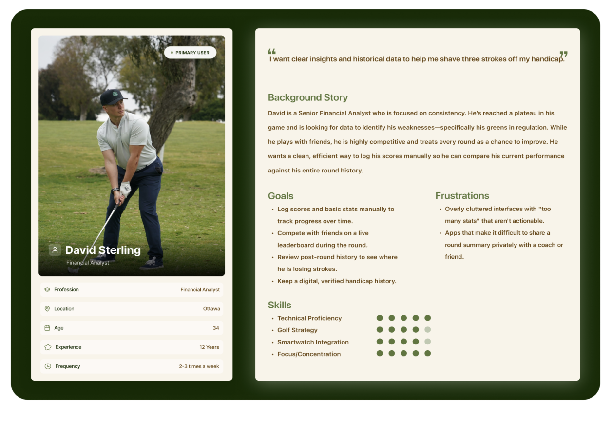
Personas
The interviews made two things clear: casual players would leave the moment the app felt complicated, and competitive players would leave the moment it felt shallow. I designed for both which meant depth had to be there, just not in the way of anyone who didn't want it.
Information Architecture
I mapped the full structure before I designed a single screen tab navigation, round flows, social layers, settings, all of it. I'd done projects where I figured this out halfway through and paid for it. I wasn't going to do that here.
Impact
+34%
Tap rate from one decision
20+
Research participants
3
Testing rounds completed
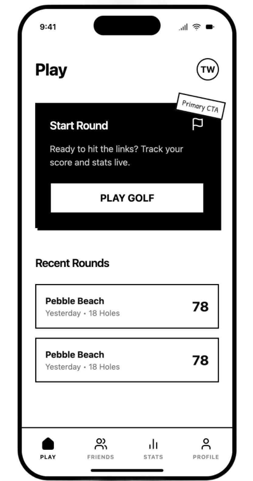
Moving the primary action into the bottom nav thumb zone a decision I almost didn't make, drove +34% more taps. I found that in round 3, not round 1.
20 participants across 3 rounds and I changed something after every single one. Each iteration earned its way in.
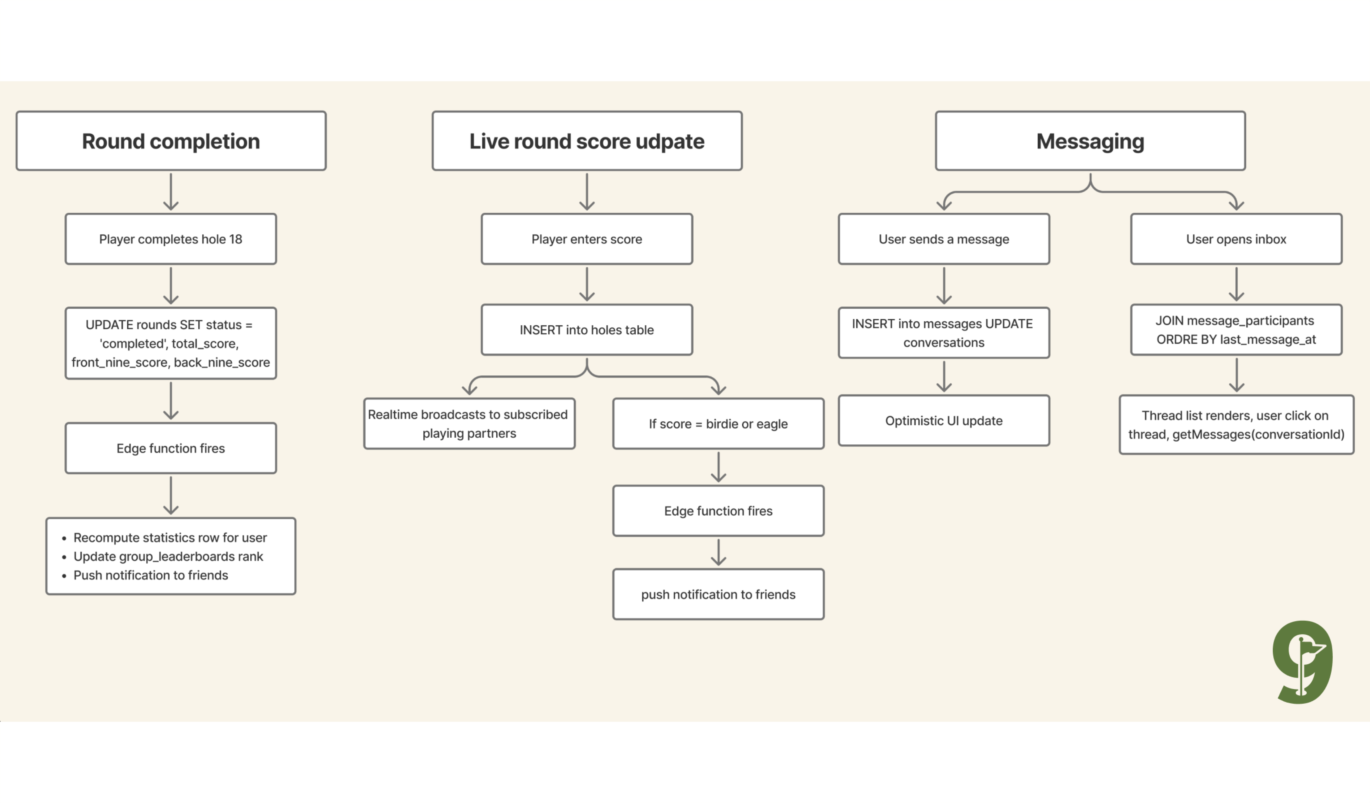
Built the full production iOS app in React Native with Supabase not just a prototype, an actual app currently in development.
Delivered a complete Figma design system, component library, typography scale, color tokens, every interaction state. Scalable from day one.
Reflection
The +34% tap rate didn't come from my first design. Or my second. It came from round 3, after I watched a user go to tap something that wasn't where they expected it to be, and then watched it happen again, across different people. That's what I keep telling people about Back9. The research wasn't a phase at the start. It ran through the entire project. And the best finding came almost at the end.
Data over intuition: I was confident about that button placement. I was wrong. The data knew better than I did,and I only got the data because I kept testing.
Social is the product: I didn't build a golf tracker. I built a place to keep the history of your game with your people. That reframe was the whole project.
Build, test, iterate — actually: Three rounds. Not one, not two. Each round found something I wouldn't have found at a whiteboard. You can't shortcut the testing.
Claude as collaborator: I used Claude for schema reviews and design critiques all the way through, not just at the end. It caught things I was too close to see.