Summary
The Problem
When I started talking to students, they all said some version of the same thing: this doesn't feel safe. The MVP worked technically, but every screen was actively undermining trust, no credentials, no ratings, a booking flow that could go wrong at any point. That's not a feature problem. That's a design problem.
The Solution
I decided the core job wasn't adding features, it was making every screen feel safe enough to act on. I rebuilt the IA from scratch, added trust signals at every decision point, built a proper component system, and reviewed the database schema with Claude before any production code was written.
Role
- Lead UX/UI Designer
- Developer
- DB Schema Reviewer
Timeline
2025- Full redesign cycle
- Research to production
- iOS mobile
Tools
- Figma & FigJam
- React Native
- Supabase
- Claude / MCP
Contributions
UX/UI Designer
- Talked to students and tutors before touching anything in Figma
- Rebuilt the IA from scratch for both user types
- Designed a complete, scalable component system in Figma
- Did a before/after analysis on every screen I redesigned
Developer & Technical Collaborator
- Built the components myself in React Native with Supabase
- Used Claude to stress-test and review the database schema
- Caught relational conflicts before they made it to production
- Made sure every design decision could actually be built
Solution
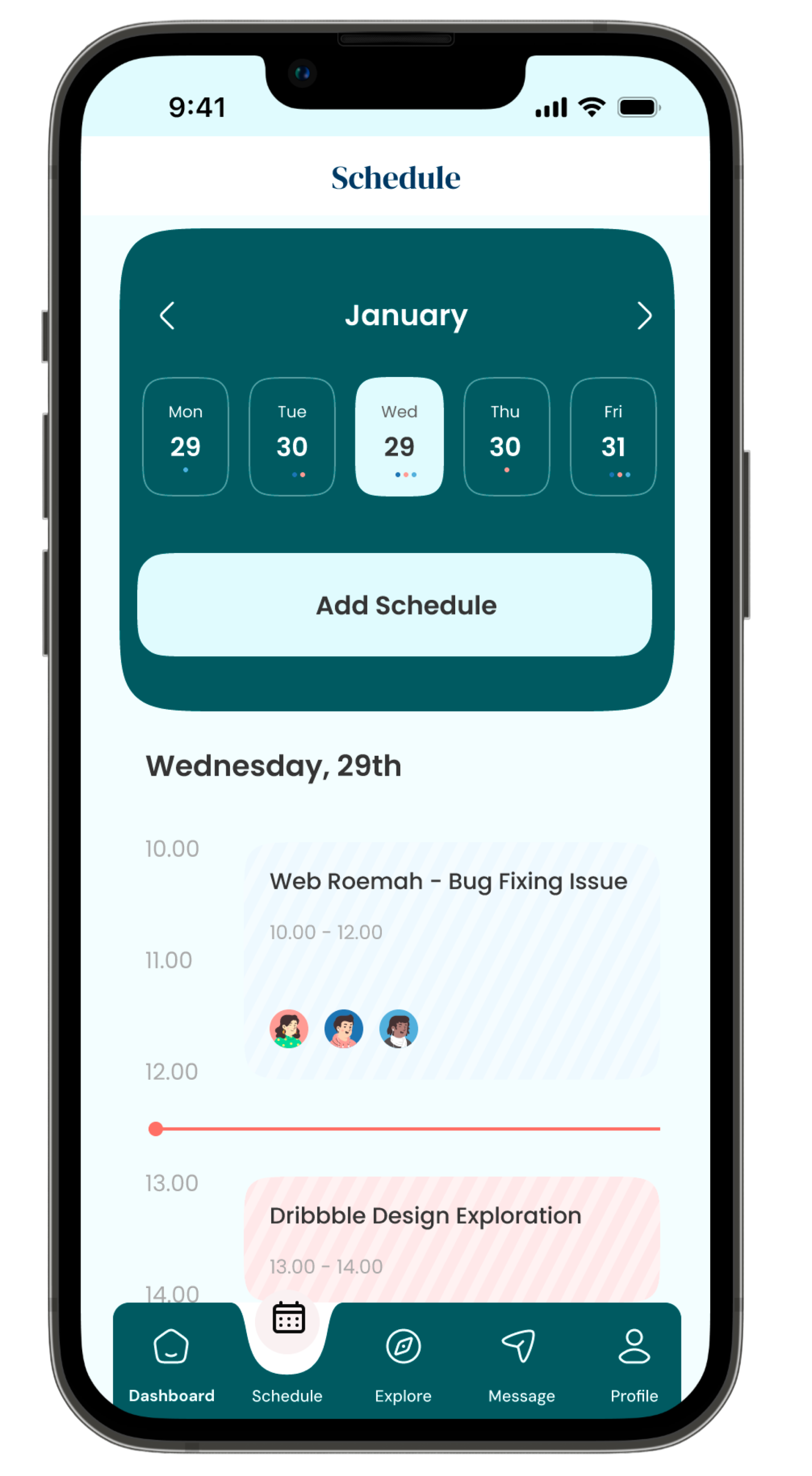
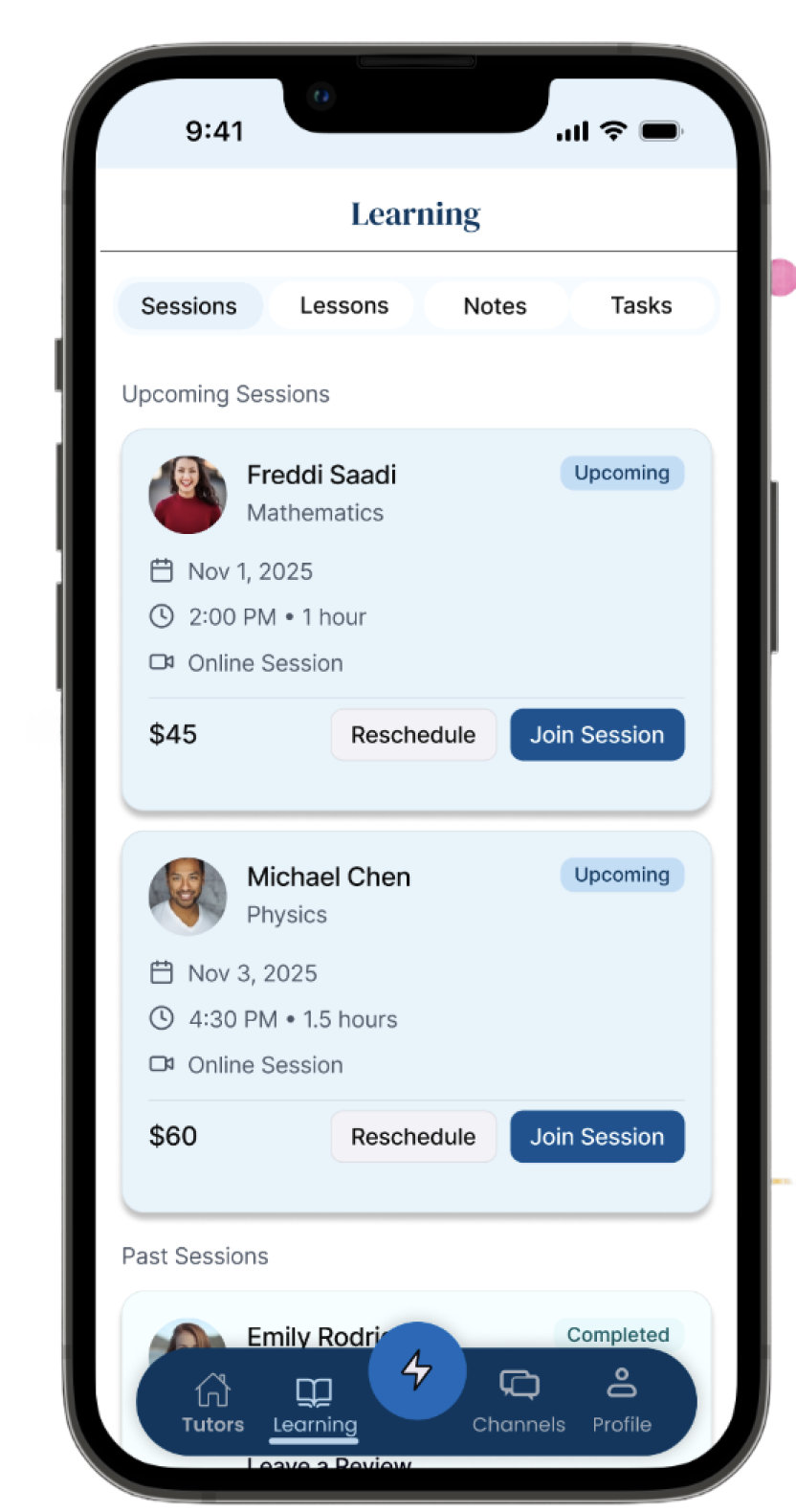
High-Fidelity Design
These aren't screens I designed because they looked clean. Each one maps to something a student or tutor told me was broken, a trust signal that was missing, a step that felt unclear, a moment where they almost gave up.
Challenge
The first time I opened the original MVP, I could see why students were dropping off. It wasn't broken, it was just hostile to trust at every step. I didn't need data to know something was wrong. But I got the data anyway, because I needed to know exactly where and why.
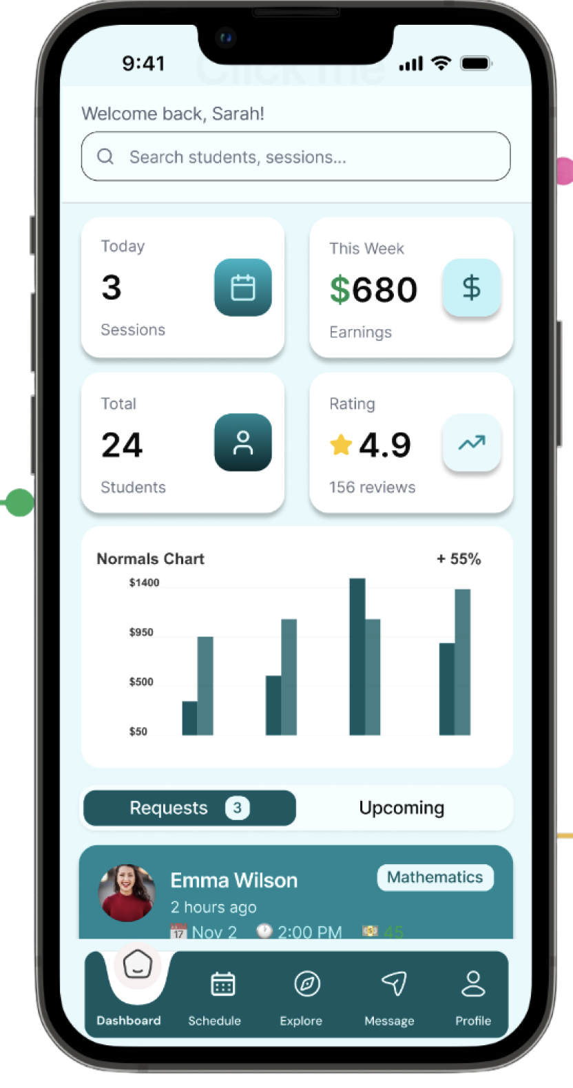
Booking confusion: Too many steps with no signal of where you were in the process. Students gave up before they ever confirmed.
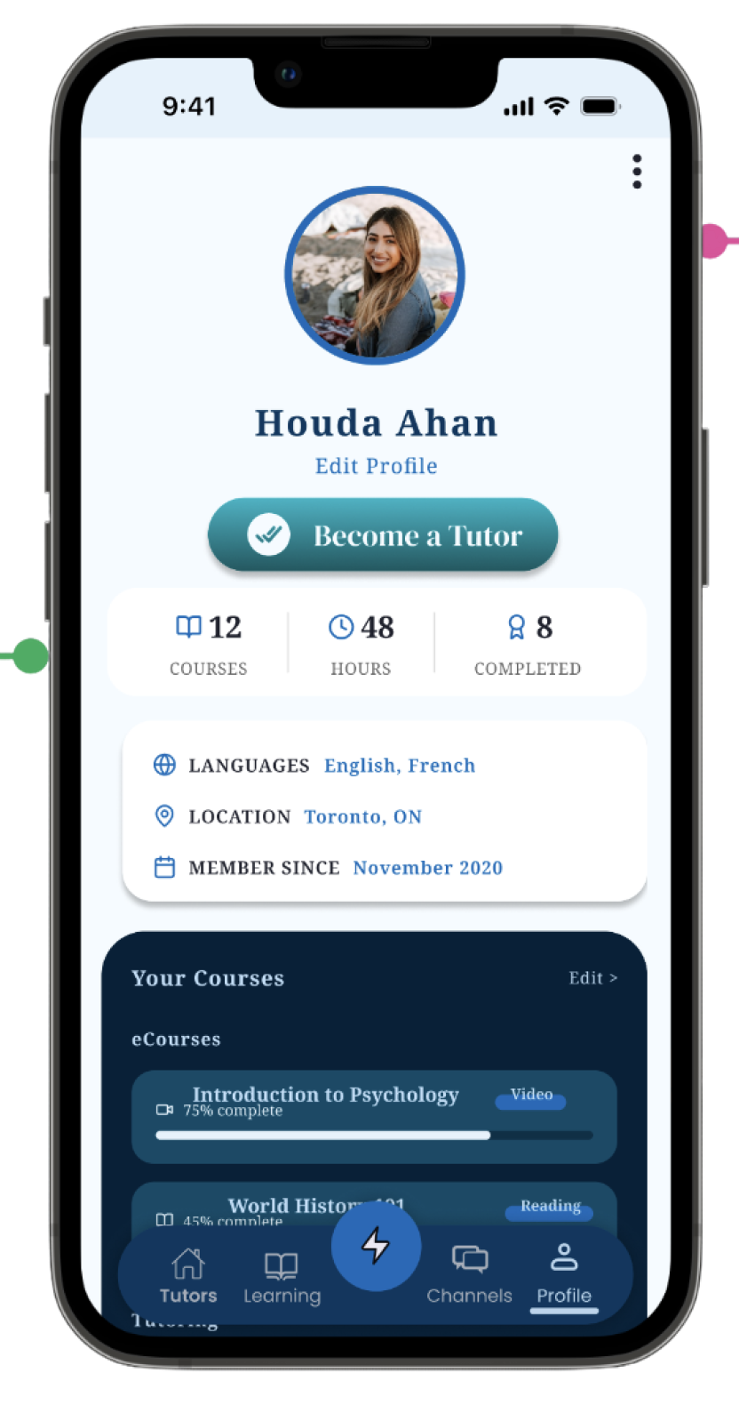
No trust signals: Tutor profiles had nothing, no credentials, no ratings, no reviews. Students told me it felt like booking a stranger off the street.
Complex navigation: Student and tutor flows were tangled together. Switching between them felt like getting lost inside the app.
Tutor discovery friction: No filtering, no matching logic, just a flat list with no way to narrow it down.
Missing review system: No way to see what previous students thought. That's the single signal that builds trust on any marketplace, and it was just absent.
Key Insights
I talked to both sides — students and tutors, because the problems looked different depending on where you were sitting. Students were hesitant to commit. Tutors didn't understand why they weren't getting booked. The answer was the same for both: the design wasn't building any trust.
Key insight: Every student I talked to said some version of "I didn't know if I could trust this." Not "the flow was confusing" trust. That told me the whole redesign had to start there. Not with information architecture, not with visual polish. With making every screen feel safe.
Design Strategy
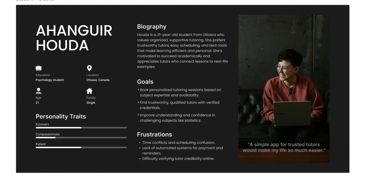
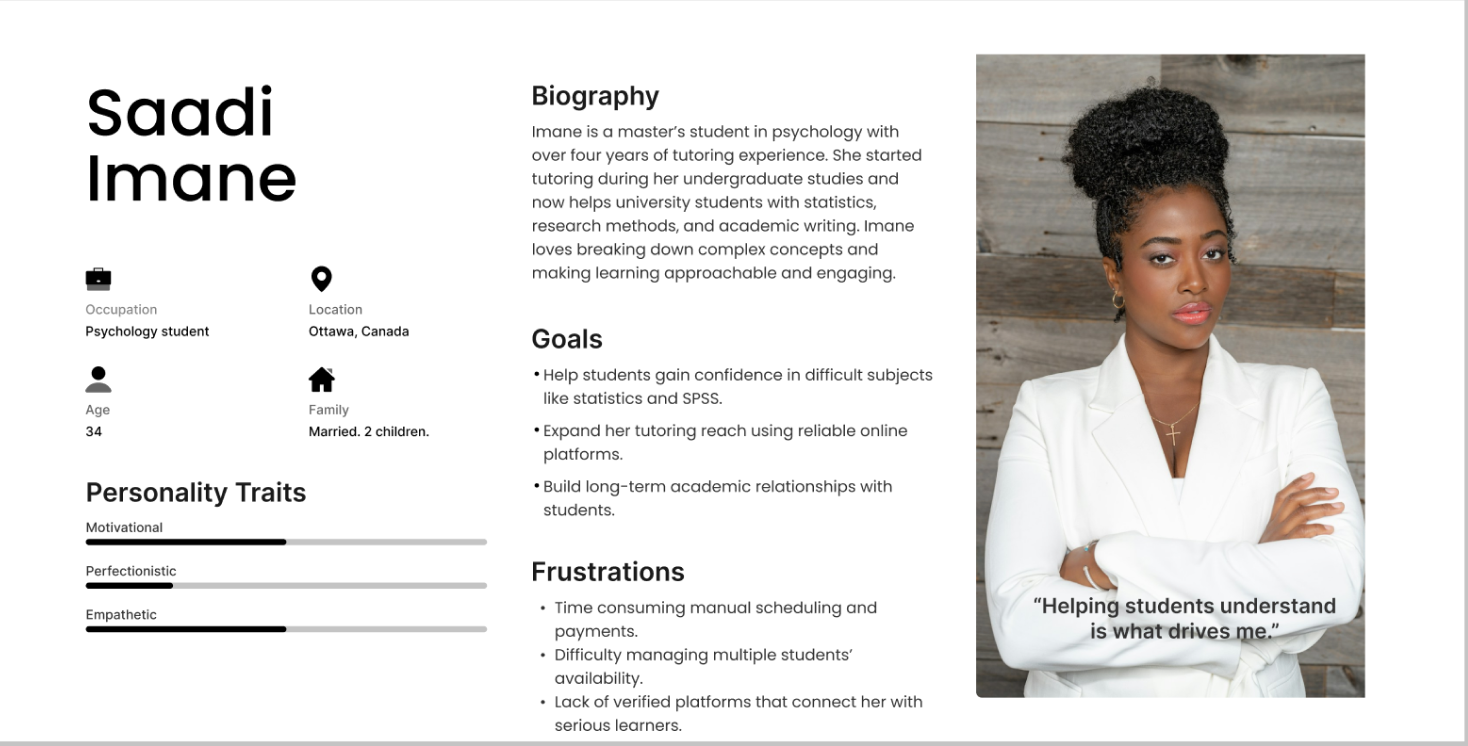
Personas
I designed for both sides from day one. Students and tutors have completely different goals, one is looking for the right match, the other is trying to build a practice. I didn't want either of them to feel like they were using a product built for the other person.
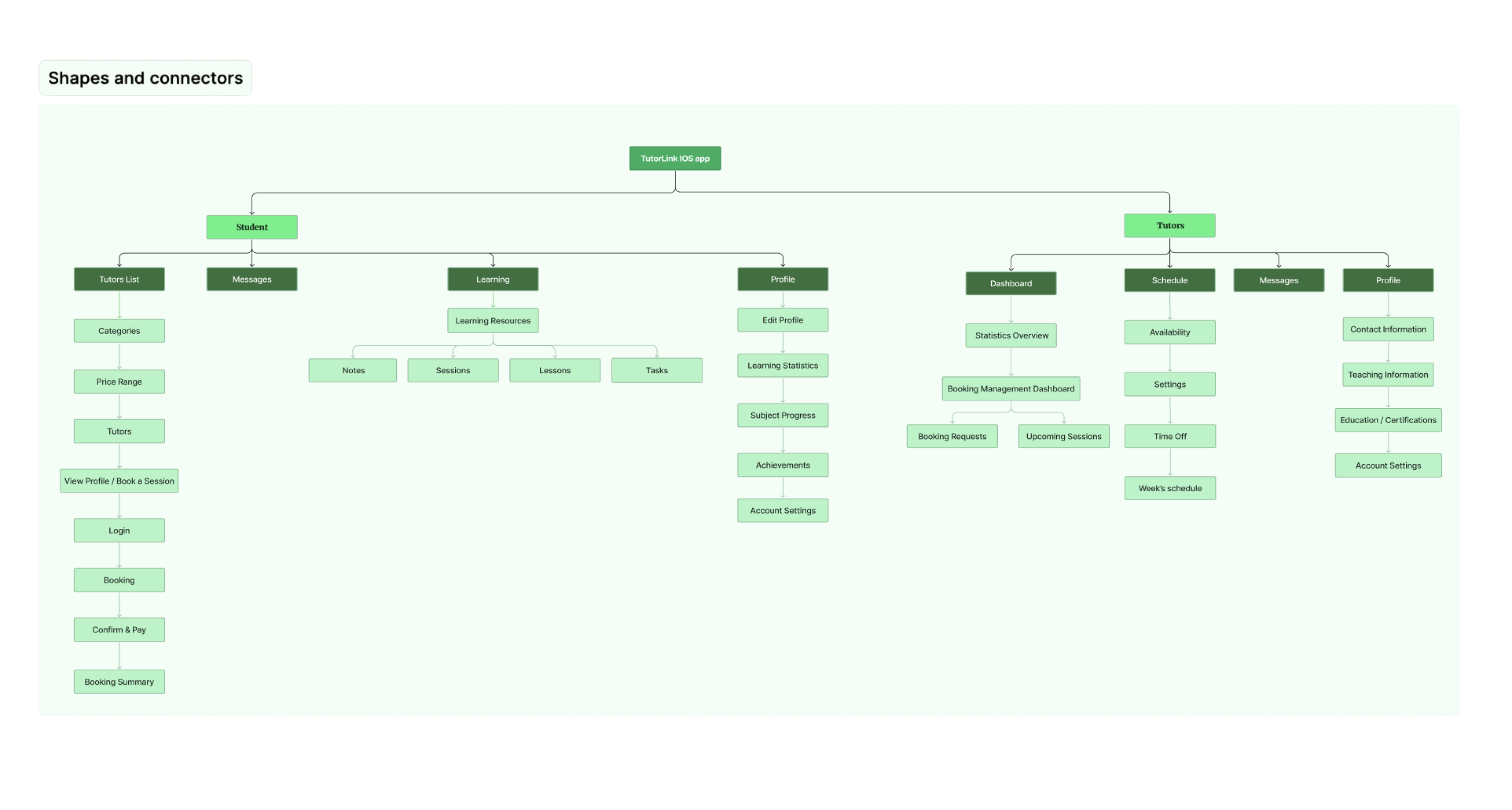
Information Architecture
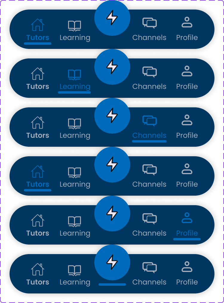
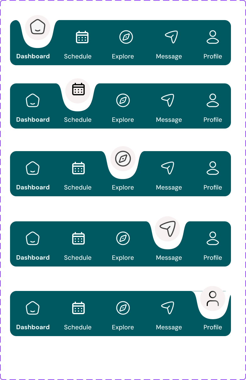
The original navigation was a maze, student flows and tutor flows were tangled in a way that made both worse. I rebuilt the IA from scratch, separated them cleanly, but kept shared infrastructure underneath so the platform didn't split into two entirely different products.
Color Palette

Components
Impact
2×
User types served
100%
Redesigned from scratch
0
Schema issues at launch
Replaced every ad-hoc MVP screen with a proper component system, consistent, scalable, and actually buildable.
Added trust signals at every decision point. credentials, ratings, reviews. Students could finally see who they were booking before committing.
Ran the database schema through Claude before a single production line was written, caught relational issues that would have cost much more to fix later.
Rebuilt the IA from scratch, student and tutor flows are now clean and distinct, running on the same underlying structure.
Reflection
The thing I keep coming back to from A+Link: trust isn't a feature you add at the end. It's built or destroyed in every small decision; which fields you show first, how many steps the booking takes, whether a tutor's credentials are visible before you have to decide. Once I reframed the project as "make students feel safe," every other decision got easier. The visual stuff followed. The structure followed. The field order followed.
Trust is the product: I stopped asking "what's confusing?" and started asking "where does this feel unsafe?" The answers were different, and far more useful.
Design and dev have to talk: Using Claude to review the schema while I was still designing meant we caught conflicts before they became expensive. I won't skip that step again.
Two personas, one IA: Designing for both a student and a tutor on the same platform pushed me to make real architectural decisions, not just stylistic ones. You can't fake clarity when both sides share the same navigation.
Before/after discipline: I mapped every change to a specific problem I found in research. If I couldn't point to the failure that justified a decision, I didn't make it. That's how the scope stayed manageable.